Tips 'N Stuff For Better Character Design
Some advice and pointers that will hopefully help you make more eye-pleasing and well-designed characters.
Table of Contents
- What’s under the skin is just as important as what’s over the skin.
- Your characters’ designs should fit the style, tone, and feel of the world or worlds they’re made for.
- Remember that more complicated design ≠ better design.
- Don’t poke out our eyes with your colors.
- Choose and use your colors wisely.
What’s under the skin is just as important as what’s over the skin.
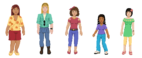
Optimally, a cast of characters would be distinguishable from each other if naked, bald, and silhouetted. For example, consider these sample designs:
Now, let’s view these characters as nude silhouettes. Each character’s body is unique enough that even without clothes and hair, each one can be told apart:
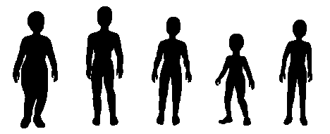
So why do this? By giving your character a unique silhouette, you will ensure that your character will be more easily recognized at a glance, or at a distance, or in adverse lighting conditions. Give your character unique silhouettes under their clothes and accessories, and you’ll make it easier to do the same no matter what your character is wearing.
If you’re creating a fan character or OC for someone else’s universe, remember: simply recoloring another character and/or changing the hair and outfit around a little (as many newbie OC creators are frequently wont to do) is not enough to make your character properly distinctive.
Your characters’ designs should fit the style, tone, and feel of the world or worlds they’re made for.
Let’s take two well-known game franchises: Super Mario and Final Fantasy. Super Mario uses bright colors and simplistic designs for its settings and characters, whereas Final Fantasy is often more ornate with more subdued hues. A Final Fantasy character put into a Super Mario game would look overwrought, dingy, and too tall and pointy, and a Super Mario character in a Final Fantasy game would look too simplistic, bright, and too short and round.
Consider ABC’s Once Upon A Time. The series’ fairytale canon is strongly inspired by Disney fairytale canon, and many of the characters’ costumes are clearly inspired by those of their Disney counterparts - but that’s the thing: they’re inspired. They’re designed to look like clothes that people in the real world might wear, or might have worn in an alternate fantasy world. Had they put the characters in the exact same costumes as worn by their cartoon counterparts, they’d have looked ridiculous and… well, cartoony.
In a whimsical candy-themed world, characters dressed in outfits clearly modeled after various candies would fit right in, whereas someone dressed in real-world streetwear might look odd and out-of-place, particularly if pretty much everyone else wore candy-themed outfits.
If you’re designing an OC, try to keep your character’s design relatively consistent with the general style of the world xe’s made for. For example, if Nightmare Before Christmas OC vampire Devin is supposed to be a resident of Halloweentown, he’d look mighty out-of-place if he looks like an attractive guy with fangs who got his clothes from Hot Topic, rather than someone who was very obviously a monster and wore outdated, if even tattered clothes. (Or basically, if he looks more like a member of Nightwish than Christopher Lee’s Dracula.)
If you’re designing an OC who is supposed to be part of a canon team or group that has some sort of uniform or theme going on, take note of what’s common across all team/group members and keep that within your new character’s design. For example, the Sol senshi in Bishoujo Senshi Sailor Moon all have white bodices and vivid colors on their skirts and collars, and all of them wear gold tiaras. The costumes all follow the same pattern.
Then you have people who design OC senshi who are supposed to be Sol senshi, but they don’t fit the overarching pattern, and the result is that they look out-of-place, if not clash completely with their supposed teammates. Likewise, I've seen entire teams of fan senshi that mix white bodices, black bodices, gray bodices, and colored bodices. Their primary colors are bold, muted, dark, and pastel. Silver tiaras are thrown in with gold tiaras. Then to top it off, sometimes they have widely varying fuku styles. The overall effect is always a complete wreck.
If you’re trying to make yourself as a character from your favorite work, don’t forget to adjust your eyes and hair to match the hues of the world. If your hair is kind of a dull blond in real life, go ahead and make it a little more vivid on your character-self if you’re designing for a vividly-colored cartoon or video game world. If your eyes are kind of a blah blue, go ahead and make them aquamarine if it fits the look of the world.
Remember that more complicated design ≠ better design.
Some people try to make their characters more unique and distinctive by adding on extra frills, details, and dinglybobs.
This is especially prevalent among OCs created for worlds where power and/or rank are associated with more frills or details. Create a flashier character, create a character whom everyone will be able to tell right away is more powerful or more important. Unfortunately, they often reach a point where they no longer accentuate the character, but distract and detract from xir. When you design a character, you want people to see a character, not an unfathomable singularity of accessories and details. In Bishoujo Senshi Sailor Moon, the costumes of the sailor senshi did tend to become frillier and more complex over time. But even Naoko Takeuchi knew when to quit - while Eternal Sailor Moon's costume was pretty frilly, Sailor Cosmos's costume took a step back toward simplicity.
When designing a character and/or costume, it’s important that you put highest priority on what needs to be there, as opposed to what you simply want to be there. The most important elements on a design are those that serve a functioning purpose, or those that say something about your character. If you add too many superfluous elements to your character’s design, you risk detracting or distracting from the important parts, and creating a design that looks cluttered and messy.
Don’t poke out our eyes with your colors.
First, stay away from the VGA colors. Y’know, these ones:
There are very few instances in which these colors can actually work - and when they do work, it’s usually when they’re used sparingly and don’t comprise the character’s entire palette (EG, Homestuck trolls). If you base your character’s entire color scheme on the VGA colors, you’re aiming for a full eyeball assault.
And while the basic color palette might be a little better, it’s not much better. If we colored the clothes and hair of sample characters from the first section with nothing but the basic color palette, we’d end up with this:
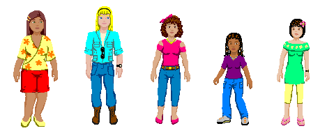
...Which is pretty blinding and gross, and there’s no way to get a decent yellow or blond. And while we’re here, let’s talk about yellow, blond, and gold. If you start from yellow and simply take the saturation down, you’re going to end up with an icky greenish-looking color, like so:
In other words, the color known as “baby poop green.”
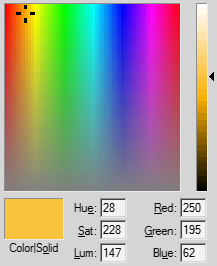
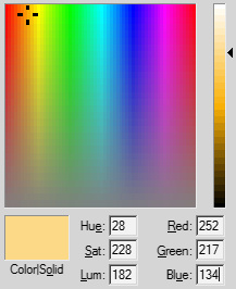
On the other hand, if you go very slightly more toward orange as you go darker, you can get a better scale:
Also, don’t ever use magenta in place of pink. Pink is found in varying places between magenta and red. Light magenta is not pink; it is merely light magenta. Light magenta is found on the top-right corner of the basic color palette; light pink is found directly to its left, just as depicted in the boxes below:
They may seem pretty similar, but when you’re trying to make, say, pink flowers and you’ve actually got magenta flowers, it actually makes a pretty big difference.
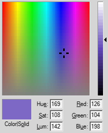
Anyway, back to eye-hurting vs. non-eye-hurting palettes - I used lower saturation values for most of the characters’ colors - which is to say, the purple shirt is actually down nearer to the bottom than the top, and the blond I used is just above medium range.
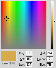
The yellows and gold are exceptions, as they’d have looked more like tan or khaki if they’d been brought down too low, so instead they’re here:
Another thing - exercise caution when mixing low-saturation and high-saturation colors. You can usually get away with mixing low-sat with mid-sat, and mid-sat with high-sat, but mixing low- and high-sat is pretty hit-or-miss. The gold and yellow examples above worked, but... a local store where I live has a design that was wrecked by using a high saturation color with an otherwise low-saturation palette. See for yourself:
Overall, it looked pretty nasty. Something like this would have looked much better:
The blue on the left has a Saturation value of 255, whereas the one on the right has a Saturation value of 92.
Choose and use your colors wisely.
Although it may be tempting to slap all of your favorite colors onto your character, remember that colors are just like any other detail. Adding too many can distract from the important elements on your character - especially if you put a color that isn't used anywhere else in a relatively unimportant spot. For example, if your character has black hair and wears entirely green and black except for a pair of golden gloves, peoples' eyes are going to be drawn to those gloves. On the other hand, if your character had golden gloves, blond hair, and gold on xir shoes, the gloves would be less eye-grabbing.
Likewise, if your character looks like xe was puked on by a rainbow, peoples' eyes will be drawn every which way. As far as rainbows go, Rainbow Dash is a pretty good example of how to use a rainbow effectively. First, her body and wings are sky-blue, which makes her design look less "busy" than if she had, say, rainbow wings and rainbow leg warmers. Secondly, her rainbow mane frames her face in such a way that it draws attention to her face, which is further helped by the fact that her eyes are a dark pink color used nowhere else.
And remember, sometimes less is more. In the 2012 Avengers film, the characters’ outfits are based on relatively simple palettes: Iron Man has red, gold, and pale blue. Thor has red, navy blue, silver, and black. Hawkeye has black and wine purple. Black Widow has black, red, and gray/silver. Hulk has green and whatever color Bruce’s pants were. Captain America has blue, red, white, and silver. Loki wears black, brass, and green. These simple color palettes are all simple, striking, and effective.
The sailor senshi from Bishoujo Senshi Sailor Moon also have fairly simple palettes, too. The fuku worn by the Sol senshi have white bodices and three additional colors each: the skirt and collar color, the bow color, and the gold on the tiara. Even Super and Eternal Sailor Moon doesn't deviate from this pattern - Super/Eternal Sailor Moon just has more gold than the others. Again - simple and effective.
Using three to five colors in a character’s wardrobe is usually a pretty safe bet. There are exceptions (eg, Rainbow Dash), but this still generally a pretty good range to work with most times.
You might also be interested in:
Hazards & Liabilities In Hair, Costume, & Wardrobe
Tips To Create Better-Looking Superhero & Supervillain Costumes
Outfit, Costume, Clothing, & Wardrobe Generators
Color Scheme Generator